If there’s one thing to take away from my Instapage review, it’s this:
The importance of a landing page cannot be overstated.
These pages are designed to focus on one thing, whether it’s to sell a product or to get people to sign up to a mailing list.
Distractions are a major issue when it comes to converting people, even things like your sites menu, or adverts or the latest post feed can have people wandering off to explore instead of taking action.
The idea behind landing pages is to reduce the clutter and shiny things that may distract people so that they focus only on what’s in front of them, which ideally is the action you want them to take.
Creating landing pages on existing websites, especially with CMS’ like WordPress, can be a chore. Also you may not want to even create a site on a domain, but just one or more landing pages instead.
Luckily there are tools out there that can assist you with this, one such is Instapage
What is Instapage?
Instapage is a “Software as a Service” (SaaS) online program that allows you to create landing pages for one or many domains.
Depending on your site setup, nearly everything is self-contained within the Instapage site allowing you to build and manage all your landing pages from one location.
Instapage uses an amazing drag and drop system to build pages, so let’s go through what it takes to get an Instapage landing page created.
Creating a New Page
Once you log into Instapage you‘ll see two buttons, one to create a new page and one to create a group.
Groups are merely for organization and you can create them and assign pages to them at a later date.
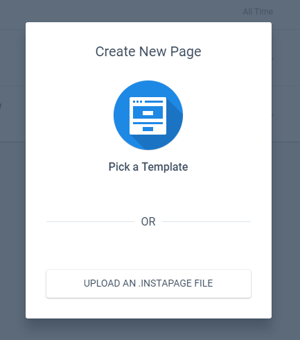
If you click the new page button you’ll see a pop up.

This allows you to create a new page from a template (including a blank one) or even upload a template from a different source.
Instapage provides you with 193 Templates, plus 1 blank one to get started with. Plus you have the ability to import free or premium templates sourced from designers located on sites like ThemeForest.
With so many template options it’s nice that Instapage have some filtering options based on the most commonly used landing page types such as Lead Generation, E-book, Apps, etc.

Some of the template designs are similar but there’s a lot of choice just in the default templates which is great, especially if you’re not too great with designing things. You can also preview these without committing to them which is a nice touch.
After selecting a template you need to name it.

After that then it’s down to modifying the template for your own needs using Instapage’s drag and drop builder.
Using the Instapage Landing Page Builder
Perhaps like me you’ve used a variety of page builders before. They often have some limitations or are awkward to use, especially when it comes to the placement of different elements like forms, images or tittles.
Instapage doesn’t suffer from this at all – it’s a true drag and drop builder and it’s a delight to use!
Every element on the page can be moved wherever you want, no blocks, no columns, nothing like that – you have full freedom to place elements wherever you want!
There is a downside to this though as while there are some guidelines (that cannot be moved), there is only a limited snap to grid system.
This means that getting elements precisely positioned can be a pain. Luckily there are some keyboard shortcuts that can be used. These aren’t mentioned anywhere that I could see but if you click an element you can use the keyboard arrows keys to move the elements a pixel at a time.
Use SHIFT + keyboard arrow keys to move elements 10 pixels at a time.
By selecting multiple elements with the shift key, you can also group elements together and change their alignment relative to one another.
One disappointment was the inability to group elements and then edit certain things such as the font color.
This means you have to select each element individually, edit it then change the color and save. Not a deal breaker but it makes things a bit more awkward and time consuming if you decide at the end that the font color should be blue and not pink.
Also, the color was not retained for new elements which made it a little frustrating when you need to add a lot of text elements to a darker background and have to constantly edit each one to change the color away from black.
Free Images
One of the pains of getting a landing page made quickly and easy is image selection. I can’t count the number of times I’ve spent more time finding and choosing an image than actually creating the content!
Instapage eases this by supplying 100 free background images. These are fairly generic but they cover a wide range of topics such as scenery, coffee cups, people typing on keyboards, and so on.

You can also buy images directly from Bigstock while within Instapage, but the prices are quite expensive at $4.99 an image – you can certainly get stock photos cheaper.

There were also two other things missing from the images: icons and patterns.
Of course you can import these, but a small selection of basic icons and patterns would have really helped make Instapage that bit more special and help validate it’s price.
Blocks
I know I said that Instapage doesn’t use a block system, and that’s still true, but it does have something called blocks.
Blocks are like mini templates for different sections of your Instapage. Included are approximately 113 templates consisting of the following types of blocks:
- Headers
- Benefits
- Descriptions
- Steps
- Testimonials
- Pricing Tables
- Call to Action
Blocks will help you speed up your page creation by allowing you to insert common elements as a framework, meaning you just need to fill in the details.

It doesn’t take long to modify a block to make a pretty professional looking section of the site and you again have the power to move any of the block elements wherever you want on the page.
You can also save your blocks for reuse on any of your other Instapage landing pages.

I’ve Ran Out of Undos
Instapage has a limited undo feature, it’s OK, but if you really need to go back more than 10 changes you’re out of luck.
The worst thing I found was the complete lack of any form of autosave. If you’re in the middle of changes, forget to save and your cat closes turns off your compute (yes, my cat has done that to me on more than one occasion), then you’re starting your landing page from scratch.
The Mobile Generator is a God-Send
By default you are on the desktop view of your landing page. By clicking the toggle at the top you can swap to the mobile view.

Instapage landing pages are not truly responsive; instead the mobile view will automatically try to turn your desktop view into something usable on mobile devices.
It’s not perfect and you will need to tweak the design to fit on mobiles.
Oddly it doesn’t show how it will look on phablets and tablets which are generally wider than your typical phone.
As such you may be tempted to preview the page and resize your browser window. This will show that the page is not responsive!
Fear not though, because I also panicked at this stage and ended up doing some tests. While resizing the browser resulted in a less than optimal site until it hits phone size, when viewed on an actual tablet or mid-sized device it looks perfect!
A/B Testing: The Most Useful Tool Offered
Before I discuss this, know that the A/B testing feature is only available on the Instapage Optimizer plan or higher: see the Pricing section below for more info.
A basic landing page can work well, but unless you already know your audience intimately a landing page will require tweaking to make it perform at its best. To do this you need to use A/B testing (also known as Split Testing).
Instapage’s A/B testing is built into the landing page builder itself, and can be activated from the top left of the page.

Click the Create an A/B Test link and you can then create a variation. You can either create a new variation (so based on your current design), or choose/import a template.
You can seemingly create as many variations as you want (I got to Variation F before I got bored), though in reality 2 of 3 versions is sufficient.
From here it’s simply a case of modifying your variations and saving.
Publishing Pages
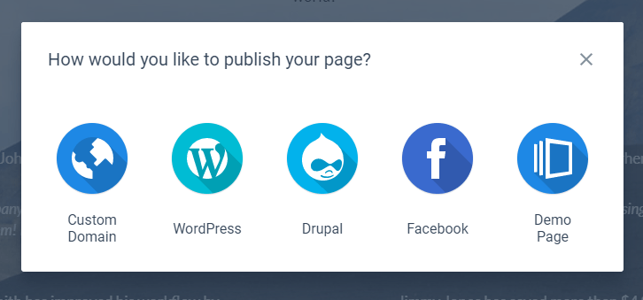
There are a few choices when it comes to actually showing the world your landing page:

Custom Domain
This is probably the most technical option as it requires you to mess about with CNAMES and things like this. It’s probably the most ideal option if you just want a domain with the landing page and that’s it or you want the landing page as a subdomain such as mylandingpage.example.com.
WordPress
If you’re a WordPress user then this is by far the easiest option. All you need to do is install a plugin and log in to Instapage from the plugin.
It will then pull your landing pages in and you can select a URL where you want the landing page to show, such as example.com/mylandingpage.
Facebook
This will show your mobile version of the page on Facebook. I actually couldn’t get this to work for some reason, but the idea is that the landing page is published to a Facebook page.
Demo Page
If you just want to see how the landing page will look on a real site then this is your option. It saves the page to a demo site which you can view live on any device. Perfect for making sure it looks right on multiple devices and in multiple browsers.
Instapage Analytics: What does it tell you?
Landing pages are worthless without knowing the stats behind them. Luckily Instapage makes this pretty easy.

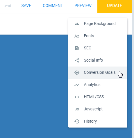
You can connect your page with Google Adwords, Google Analytics, Facebook Pixel and Google Tag Manager.
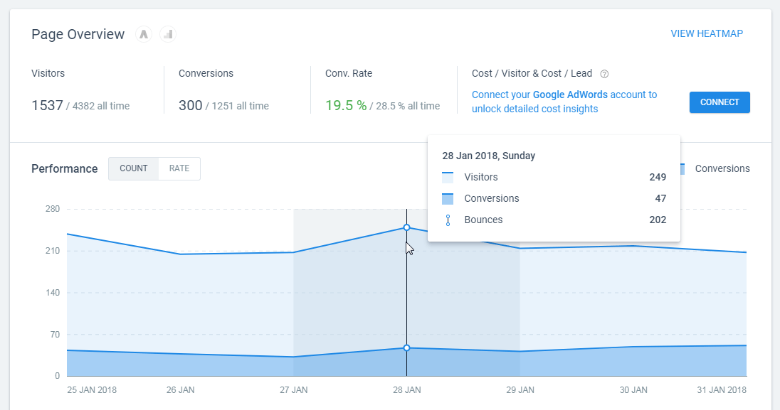
As well as that you can set conversion goals for links and subscriptions which are shown in Instapage’s own analytics section.

Another handy tool that Instapage provides is the Heatmap tool. This allows you to see precisely what people are doing on your page.
There are 3 types of heatmaps you can view:
- Scroll depth – how far down the page people scrolled
- Clicks – where on the page people clicked
- Mouse movement – where the mouse was located on the screen
Combined, these different analytics systems and features should give you more than enough information to make informed decisions about the page and what tweaks need to be made.

Documentation
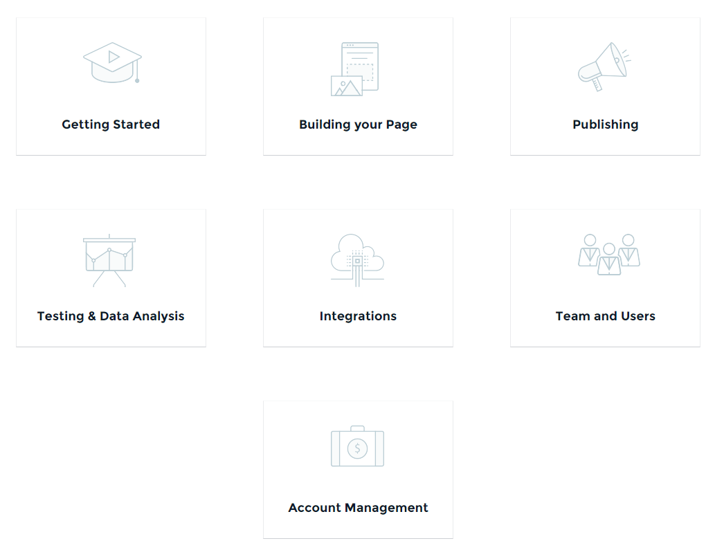
While Instapage is quite intuitive, there are a lot of hidden settings and features, so I was glad to see that the documentation for Instapage is large and detailed.

As well as written text that has plenty of pointer images, the most popular topics also have accompanying videos.
The documentation is clear and easy to follow, which is perfect for when you get stuck with something!
Instapage Pricing
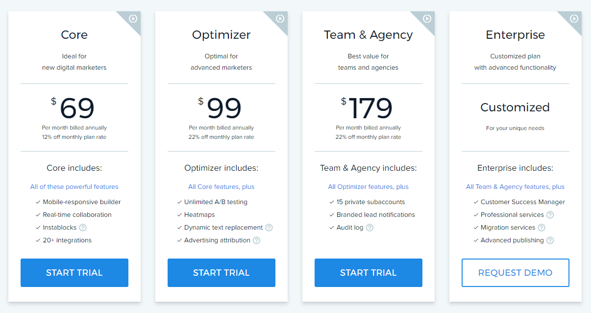
Instapage starts at $69 per month and goes up $179 per month with even more expensive Enterprise options out there.
Quality products cost time and money to make, and as such they can often cost the end user a decent amount as well.

If you want A/B testing (which you should want) and Heatmaps, then you’ll need to go for the middle level, Optimizer.
As well as that the month to month prices are significantly higher than the annual pricing. At the Optimizer level, paying month to month will cost you $30 per month extra.
I get that paying annually should offer a saving, but it does feel like they are gouging monthly subscribers.
Is Instapage Worth it?
If you are an occasional user, it’s hard to justify the high-monthly costs, especially when you need the more expensive plans to unlock the best features.
A one-month minimum trial is strongly recommended. You can test your current landing page against variations to see what exactly you are leaving behind.
If you are someone running multiple campaigns perhaps even over multiple websites then yes, it is definitely worth it.
The ease of creating pages and the added features easily offset the cost if you’re using landing pages regularly.
Why Not Use a WordPress Landing Page Builder Instead?
There are a lot of landing page solutions out there, especially for WordPress so you might be wondering why Instapage is a better alternative.
Well, as mentioned above, if you’re a very light user or low on funds, then a WordPress alternative probably is better for you.
If you’re a power user then there are several reasons why you should consider Instapage over the alternatives:
It’s Easy
I can’t get over how beautiful and easy to use the Instapage builder is. Sure it has some areas that could be improved, but I’ve used a lot of builders and this one was an absolute delight to use. There will be no more fighting the builder to get the exact layout you want, which is priceless.
It’s Just for Landing Pages
If you look at something like Thrive Leads for example, Thrive do a lot of other products including Leads. Instapage focus purely on their Landing Page product so all of their time, expertise and effort goes into making it the best landing page system out there.
Multiple Pages, Multiple Sites
This is a big one for a power user: you can manage all your landing pages across numerous domains from one control panel. Not more logging into this site or that site or dealing with different software on different sites.
Asset Management
Instapage allows you to host assets directly on their server and server them to your subscribers directly.
The Bottom Line
I’m beyond impressed with the features offered by Instapage.
With the free trial they offer, it’s a no-brainer that this one comes with a very positive recommendation.
It’s not the cheapest option out there, in fact it’s fairly expensive, so you do really need to make sure you’ll use it.
If you can get over the price then the builder is wonderful, and so easy to use you’ll be firing out landing pages left, right and center!
I’d definitely recommend Instapage to anyone with multiple sites who needs to have multiple landing pages across the site network.

